


Case study 01 / 26 · 2018 · Kinderhaus 24 brand development
Giving a little town for little ones an identity.
Kinderhaus 24.
Arbeiter-Samariter-Bund
- Master concept
- Web design
- Design
- Texts
- Photography
The core idea
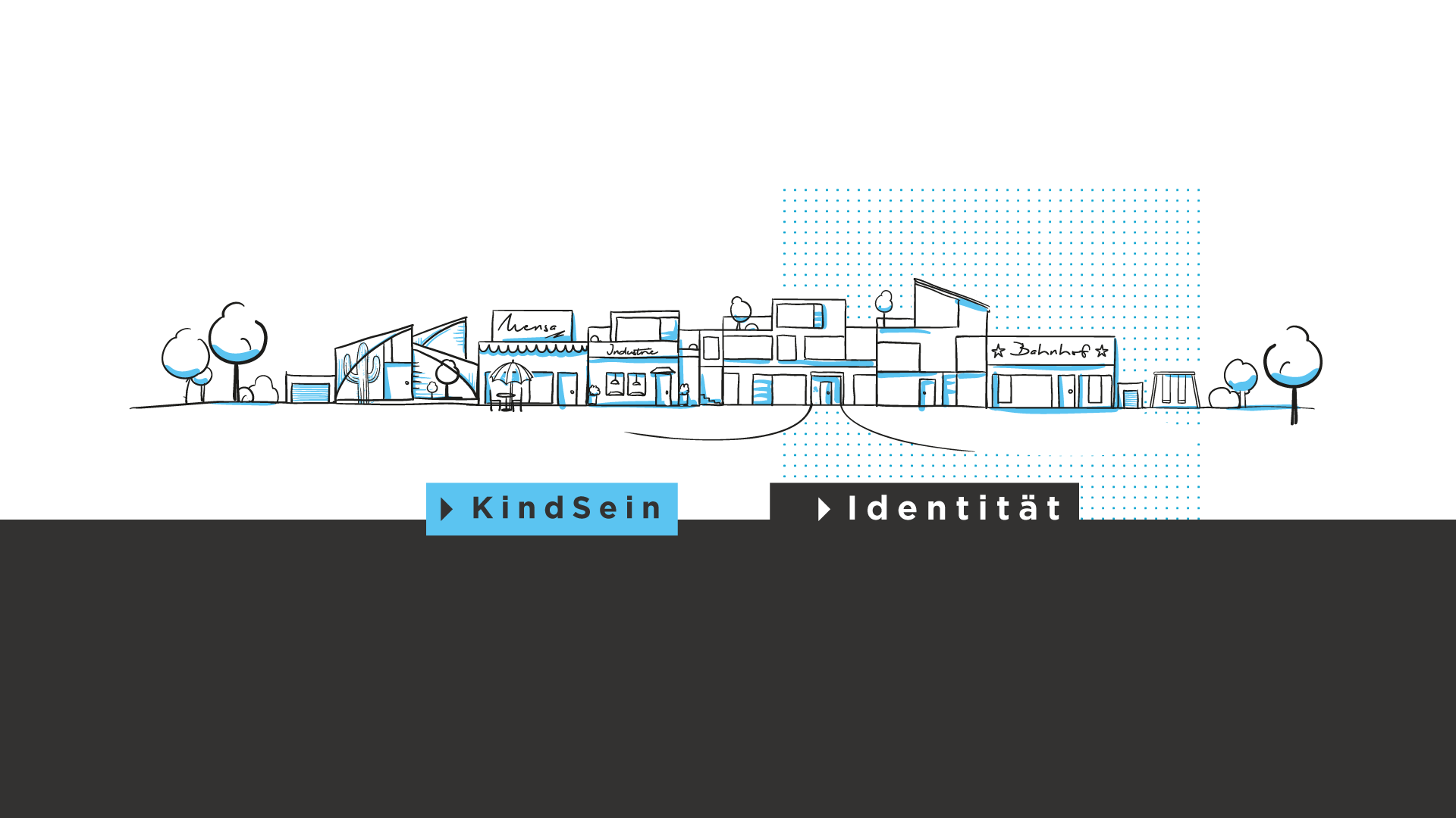
Architecture and education as a small-town landscape: making a new service clear at a glance.
- Expertise
- Branding
- Design & Story
- Filmmaking
Project overview · Kinderhaus 24 brand development
The mission.
- Organisation
- Arbeiter-Samariter-Bund Regionalverband Nürnberger Land e. V.
- Campaign
- Creating a new brand
- Focus
- Corporate identity, corporate design, corporate website, corporate copywriting
- Timeline
- 3 months in production

The story
From challenge to solution.
The starting point
The brief was to bring architecture and education together in a visual concept, reach every audience and explain a complex offering that had never been presented in this form on a website. There was no logo or wider design identity. A series of conversations and briefings established what needed to be created.
The solution
The name, alongside education and architecture, provided the starting point. The right colour palette and a carefully directed approach to imagery brought many key elements naturally into place. Illustrations of a ‘small-town landscape’ helped explain this ‘new sector’. The copy and slogans used clear, contemporary business language.
Production
Development of a corporate concept for the corporate identity and design · Creation of all copy and slogans · Creation of the corresponding corporate design · Design, build and development of the new Kinderhaus24.de website
Artwork
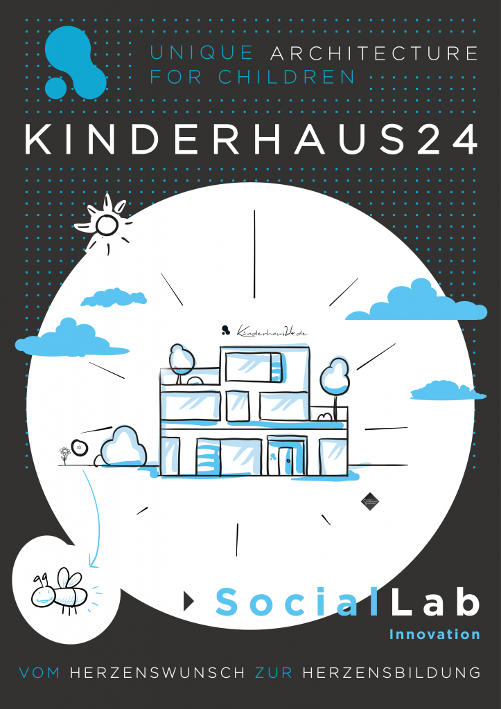
Logo. Key visual.

Project output
4 pieces of evidence.


Next case study
Catholic Child & Youth Services→ Start your projectAll workImages: original project material. Copy edited by Universal Brands.